Oh Alegreya, I Just Can’t Quit You
At the risk of placing myself squarely in “old man yells at cloud” territory, I can still remember when web typography was effectively limited to about a dozen or so web-safe fonts, i.e., typefaces that could be trusted to be installed in a majority of computers, meaning websites using them would render consistently and reliably. This exclusive group of typefaces included the likes of Arial, Georgia, Times New Roman, and Verdana.
(I’m also old enough to remember the web-safe color palette and limiting website layouts to a width of 580 pixels because 640x480 was the most common resolution. Now… get off my lawn.)
The explosion of web fonts in the last 10 – 15 years via services like Google Fonts and Adobe Fonts (formerly Typekit) means that web designers now have access to hundreds, if not thousands, of typefaces. It’s never been easier to implement gorgeous typefaces for a website, with more arriving all the time.
Even so, I have certain typefaces that I consistently rely on. Rasmus Andersson’s Inter is a gorgeous and flexible sans-serif that’s perfect for web interfaces. Its heyday might’ve passed, but I still use Mark Simonson’s Proxima Nova when I want a website to look clean, slick, and modern. Christian Thalmann’s Cormorant and Claus Eggers Sørensen’s Playfair Display are serif typefaces that exude elegance and refinement. (Playfair Display’s italics are particularly lovely.)

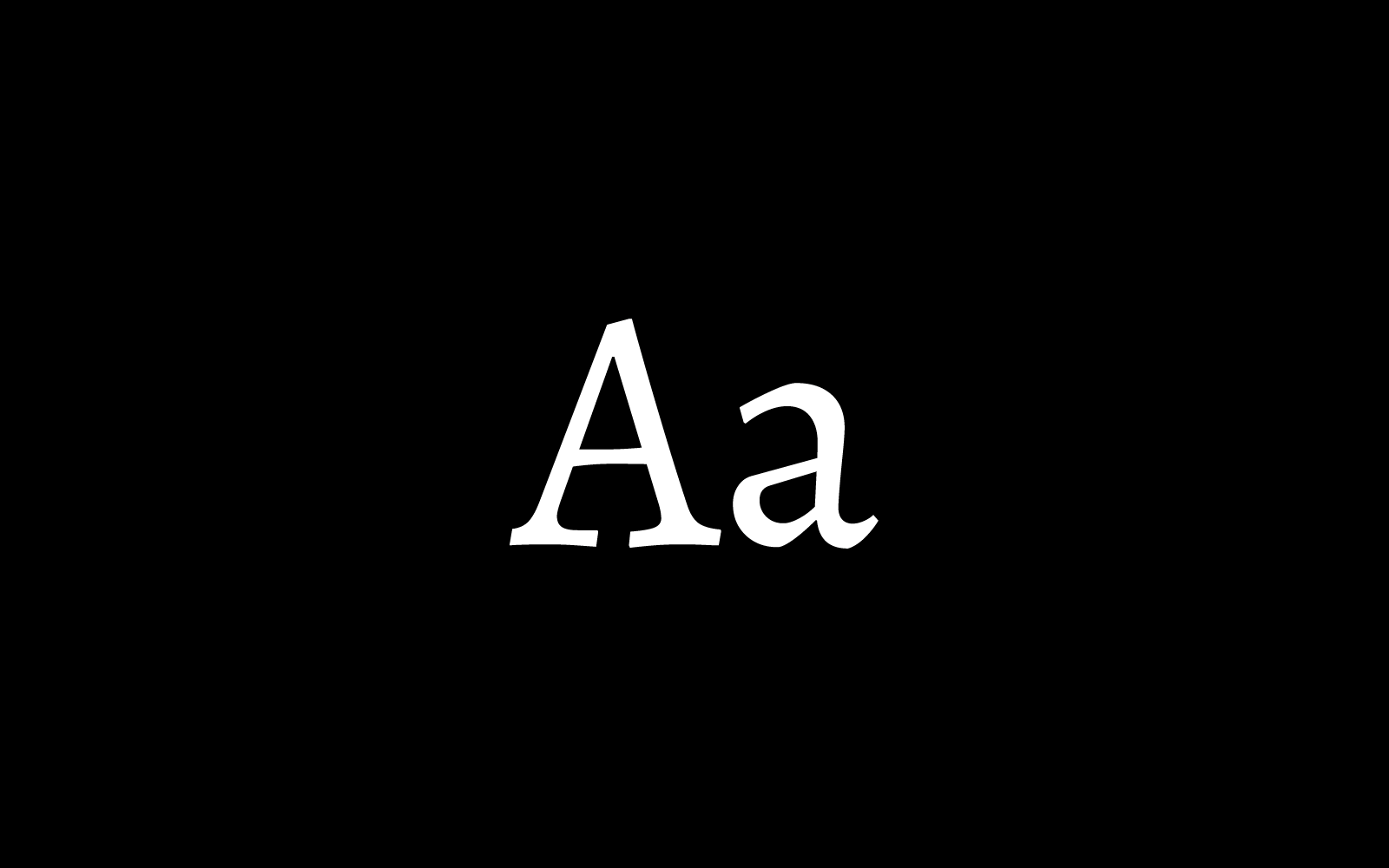
Which brings me to Juan Pablo del Peral’s Alegreya, a serif typeface designed for the Argentinian type foundry Huerta Tipográfica that is arguably my favorite typeface, possibly of all time. (Sorry, Mrs Eaves.)
I’ve been using Alegreya on Opus since at least 2019. As I recall, I wanted a serif that would work well for both headlines and body copy, but also had some personality and pizzazz. Which is precisely what I found with Alegreya.
Originally designed for use in literature, and thus ideal for long text, Alegreya references more traditional calligraphic styles albeit “in a contemporary typographic language.” For a perfect example of that, look no further than Alegreya’s “Q”; that long tail descender looks like it was made with a calligraphy pen, giving it an exotic manuscript-y look without feeling too traditional or old-fashioned. As a result, Alegreya pairs really well with a good sans-serif. I’m currently pairing it with Avenir Next, but Raleway, Source Sans, and Work Sans can also make for nice sans-serif pairings.
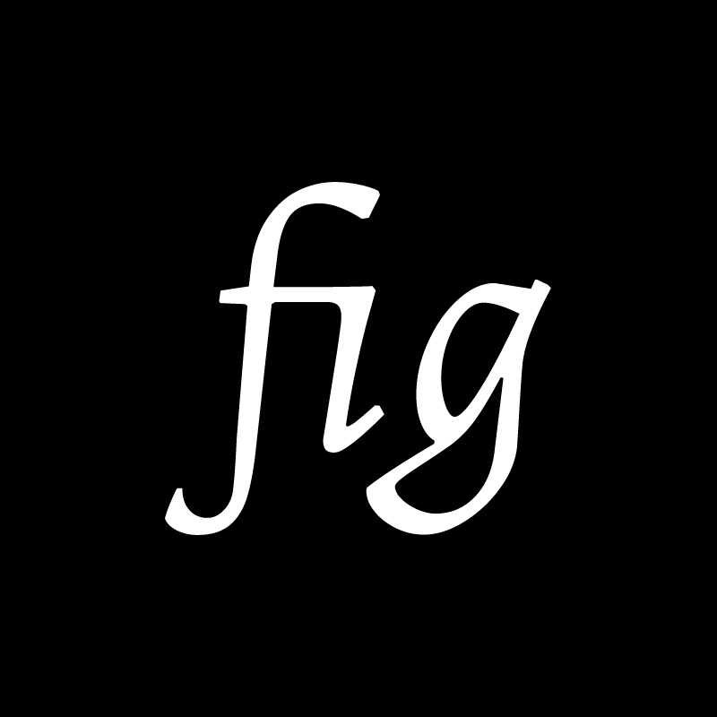
Alegreya also comes with multiple weights, an italics version, and even ligatures. The italics add some really cool-looking glyphs, with my favorite being the italicized “g.” It looks very distinctive and unlike anything else in the glyph set and yet still feels of a piece with it. The ligatures, like “fi,” are tastefully done, adding to the typeface’s graceful sense of flow.
As for special characters like ampersands (&) and section signs (§), I don’t use them all too often but I love how they look. They’re just more evidence of the amount of care and effort that del Peral poured into Alegreya, as is the fact that Alegreya is part of a typeface “super family” that includes sans-serif and small caps variations.
I’m far from alone in singing Alegreya’s praises. Do a search for “best Google fonts” and chances are, many of the results will feature Alegreya in their recommendations. Typewolf’s Jeremiah Shoaf considers Alegreya “one of the absolute best fonts available on Google Fonts” and it was chosen as one of 53 “Fonts of the Decade” at the ATypl Letter.2 competition in September 2011. Finally, as an indication of its popularity and utility, Google Fonts reports that Alegreya is used on over 350,000 websites and has been served over 77 million times in the last week alone.
I won’t go so far as to say that switching your website to Alegreya will automatically make it look better. But with its graceful characters, lovely idiosyncrasies (e.g., that italicized “g”), and thoughtful, balanced design, Alegreya can definitely be a solid foundation for a beautiful website.