Building a Better Social Media Post with Semantic HTML
As a web development nerd, I’m often interested in stuff that would probably never cross most people’s minds. Like, for instance, the front-end code that’s used by social media platforms.
Although I don’t work on anything close to the scale of a social media platform, I’m nevertheless curious about how they do things, and what I can learn from them. With their massive budgets and large teams, not to mention global user bases, how do they write and architect their code? What sort of HTML and CSS do they use? (For what it’s worth, I’m not the only one who asks such questions.)
Now that Threads has a web interface, I took a peek “under the hood” of both Threads and Bluesky, arguably the two biggest Twitter alternatives out there. (Especially since Pebble is no more.) What I saw left me scratching my head.
Consider these sample posts from my profiles on Threads and Bluesky. (Note: I’ve removed the posts’ content in order to just focus on their HTML structure.) Here’s what a standard Threads post looks like:
<div class="x78zum5 xdt5ytf">
	<div class="x9f619 x1n2onr6 x1ja2u2z">
		<div class="x1a2a7pz x1n2onr6">
			<div class="x1bl2z55 x1frmxcx x1l90r2v x1iorvi4 x1sqbtui" data-pressable-container="true" data-interactive-id="">
				<div class="xpvyfi4 x1xdureb x1agbcgv"></div>
				<div class="xrvj5dj xd0jker x11ql9d">
					<div class="xcrlgei xqti54a x1agbcgv xexx8yu">
						<div class="x1ywlc9c x1tlxs6b x1g8br2z x1gn5b1j x230xth x1n2onr6 xc9qbxq x14qfxbe">
							<a class="x1i10hfl xjbqb8w x6umtig x1b1mbwd xaqea5y xav7gou x9f619 x1ypdohk xt0psk2 xe8uvvx xdj266r x11i5rnm xat24cr x1mh8g0r xexx8yu x4uap5 x18d9i69 xkhd6sd x16tdsg8 x1hl2dhg xggy1nq x1a2a7pz x1tlxs6b x1g8br2z x1gn5b1j x230xth" href="/@jasonopus" role="link" tabindex="0">
								<div class="x90nhty x14yjl9h xudhj91 x18nykt9 xww2gxu x78zum5 x1jwls1v x17fnjtu" style="--height: 36px; --width: 36px;">
								</div>
							</a>
						</div>
					</div>
					<div class="x1xdureb xamitd3 xqti54a x1agbcgv">
						<div class="xrvj5dj x79809l x5yr21d">
							<div class="xamitd3 xcrlgei">
								<span class="x6s0dn4 x78zum5 x1q0g3np">
								<div class="">
									<div>
										<a class="x1i10hfl xjbqb8w x6umtig x1b1mbwd xaqea5y xav7gou x9f619 x1ypdohk xt0psk2 xe8uvvx xdj266r x11i5rnm xat24cr x1mh8g0r xexx8yu x4uap5 x18d9i69 xkhd6sd x16tdsg8 x1hl2dhg xggy1nq x1a2a7pz xp07o12 xzmqwrg x1citr7e x1kdxza xt0b8zv" href="/@jasonopus" role="link" tabindex="0">
											<span class="x1lliihq x1plvlek xryxfnj x1n2onr6 x193iq5w xeuugli x1fj9vlw x13faqbe x1vvkbs x1s928wv xhkezso x1gmr53x x1cpjm7i x1fgarty x1943h6x x1i0vuye xjohtrz x1s688f xp07o12" dir="auto" style="line-height: var(--base-line-clamp-line-height); --base-line-clamp-line-height: calc(1.4 * 1em);">jasonopus</span>
										</a>
									</div>
								</div>
								</span>
							</div>
							<div class="x6s0dn4 xamitd3 x78zum5 x1q0g3np x1xdureb x1fc57z9">
								<span class="x1lliihq x1plvlek xryxfnj x1n2onr6 x193iq5w xeuugli x1fj9vlw x13faqbe x1vvkbs x1s928wv xhkezso x1gmr53x x1cpjm7i x1fgarty x1943h6x x1i0vuye xjohtrz xo1l8bm x12rw4y6 x1tu3fi x3x7a5m" dir="auto" style="line-height: var(--base-line-clamp-line-height); --base-line-clamp-line-height: calc(1.4 * 1em);">
									<a class="x1i10hfl xjbqb8w x6umtig x1b1mbwd xaqea5y xav7gou x9f619 x1ypdohk xt0psk2 xe8uvvx xdj266r x11i5rnm xat24cr x1mh8g0r xexx8yu x4uap5 x18d9i69 xkhd6sd x16tdsg8 x1hl2dhg xggy1nq x1a2a7pz x1lku1pv x12rw4y6 xrkepyr x1citr7e x37wo2f" href="/@jasonopus/post/C0IMaNrMhiF" role="link" tabindex="0"><time class="x1rg5ohu xnei2rj x2b8uid" datetime="2023-11-26T23:40:20.000Z" title="Nov 26, 2023, 5:40 PM" data-visualcompletion="ignore-dynamic">1d</time></a>
								</span>
								<div class="x146dn1l x11t77rh x1thhq0t xf6uls8 x17adc0v xr9ek0c xw4jnvo">
									<div class="x1i10hfl xjbqb8w xjqpnuy xa49m3k xqeqjp1 x2hbi6w x13fuv20 xu3j5b3 x1q0q8m5 x26u7qi x972fbf xcfux6l x1qhh985 xm0m39n x9f619 x1ypdohk xdl72j9 x2lah0s xe8uvvx xdj266r x11i5rnm xat24cr x1mh8g0r x2lwn1j xeuugli xexx8yu x4uap5 x18d9i69 xkhd6sd x16tdsg8 x1hl2dhg xggy1nq x1ja2u2z x1t137rt x1o1ewxj x3x9cwd x1e5q0jg x13rtm0m x1q0g3np x87ps6o x1lku1pv x1a2a7pz x6s0dn4 x78zum5 x5yr21d xl56j7k x1n2onr6 xh8yej3" role="button" tabindex="0">
										<div class="x6s0dn4 x78zum5 xl56j7k xx6bhzk x11xpdln x12w9bfk">
											<div class="x5yr21d x10l6tqk xh8yej3">
												<div class="x90nhty x14yjl9h xudhj91 x18nykt9 xww2gxu xc9qbxq x10l6tqk xvqlfdi x1ogtga9 xpwpydw x14qfxbe"></div>
											</div>
											<svg aria-label="More" class="x1lliihq x1n2onr6 x1yxark7" fill="currentColor" height="20" role="img" viewBox="0 0 24 24" width="20">
												<title>More</title>
												<circle cx="12" cy="12" r="1.5"></circle>
												<circle cx="6" cy="12" r="1.5"></circle>
												<circle cx="18" cy="12" r="1.5"></circle>
											</svg>
										</div>
									</div>
								</div>
							</div>
						</div>
					</div>
					<div class="xqti54a x13vxnyz x49hn82 xcrlgei x889kno">
						<div>
							<div class="x1a6qonq xj0a0fe x126k92a x6prxxf x7r5mf7">
								<span class="x1lliihq x1plvlek xryxfnj x1n2onr6 x193iq5w xeuugli x1fj9vlw x13faqbe x1vvkbs x1s928wv xhkezso x1gmr53x x1cpjm7i x1fgarty x1943h6x x1i0vuye xjohtrz xo1l8bm xp07o12 xat24cr xdj266r" dir="auto" style="line-height: var(--base-line-clamp-line-height); --base-line-clamp-line-height: calc(1.4 * 1em);"></span>
							</div>
							<div class="x1egtr07"></div>
							<div class="x1orzsq4 x1k70j0n">
								<div class="xrvj5dj xjn6g71">
									<div class="x6s0dn4 x78zum5 xc9qbxq xl56j7k x14qfxbe">
										<div class="x1i10hfl xjbqb8w xjqpnuy xa49m3k xqeqjp1 x2hbi6w x13fuv20 xu3j5b3 x1q0q8m5 x26u7qi x972fbf xcfux6l x1qhh985 xm0m39n x9f619 x1ypdohk xdl72j9 x2lah0s xe8uvvx xdj266r x11i5rnm xat24cr x1mh8g0r x2lwn1j xeuugli xexx8yu x4uap5 x18d9i69 xkhd6sd x16tdsg8 x1hl2dhg xggy1nq x1ja2u2z x1t137rt x1o1ewxj x3x9cwd x1e5q0jg x13rtm0m x1q0g3np x87ps6o x1lku1pv x1a2a7pz x6s0dn4 x78zum5 x5yr21d xl56j7k x1n2onr6 xh8yej3" role="button" tabindex="0">
											<div class="x6s0dn4 x78zum5 xl56j7k xx6bhzk x11xpdln x12w9bfk">
												<div class="x5yr21d x10l6tqk xh8yej3 xi1g0f7 x1pdr0v7">
													<div class="x90nhty x14yjl9h xudhj91 x18nykt9 xww2gxu xc9qbxq x10l6tqk xvqlfdi x1ogtga9 xpwpydw x14qfxbe"></div>
												</div>
												<svg aria-label="Like" class="x1lliihq x1n2onr6 x1yxark7" fill="transparent" height="19" role="img" viewBox="0 0 24 22" width="20">
													<title>Like</title>
													<path d="M1 7.66c0 4.575 3.899 9.086 9.987 12.934.338.203.74.406 1.013.406.283 0 .686-.203 1.013-.406C19.1 16.746 23 12.234 23 7.66 23 3.736 20.245 1 16.672 1 14.603 1 12.98 1.94 12 3.352 11.042 1.952 9.408 1 7.328 1 3.766 1 1 3.736 1 7.66Z" stroke="currentColor" stroke-width="2"></path>
												</svg>
											</div>
										</div>
									</div>
									<div class="x6s0dn4 x78zum5 xc9qbxq xl56j7k x14qfxbe">
										<div class="x1i10hfl xjbqb8w xjqpnuy xa49m3k xqeqjp1 x2hbi6w x13fuv20 xu3j5b3 x1q0q8m5 x26u7qi x972fbf xcfux6l x1qhh985 xm0m39n x9f619 x1ypdohk xdl72j9 x2lah0s xe8uvvx xdj266r x11i5rnm xat24cr x1mh8g0r x2lwn1j xeuugli xexx8yu x4uap5 x18d9i69 xkhd6sd x16tdsg8 x1hl2dhg xggy1nq x1ja2u2z x1t137rt x1o1ewxj x3x9cwd x1e5q0jg x13rtm0m x1q0g3np x87ps6o x1lku1pv x1a2a7pz x6s0dn4 x78zum5 x5yr21d xl56j7k x1n2onr6 xh8yej3" role="button" tabindex="0">
											<div class="x6s0dn4 x78zum5 xl56j7k xx6bhzk x11xpdln x12w9bfk">
												<div class="x5yr21d x10l6tqk xh8yej3 x1bp8bn4 xeb58b7">
													<div class="x90nhty x14yjl9h xudhj91 x18nykt9 xww2gxu xc9qbxq x10l6tqk xvqlfdi x1ogtga9 xpwpydw x14qfxbe"></div>
												</div>
												<svg aria-label="Reply" class="x1lliihq x1n2onr6 x1yxark7" fill="currentColor" height="20" role="img" viewBox="0 0 24 24" width="20">
													<title>Reply</title>
													<path d="M20.656 17.008a9.993 9.993 0 1 0-3.59 3.615L22 22Z" fill="none" stroke="currentColor" stroke-linejoin="round" stroke-width="2"></path>
												</svg>
											</div>
										</div>
									</div>
									<div class="x6s0dn4 x78zum5 xc9qbxq xl56j7k x14qfxbe">
										<div class="x1i10hfl xjbqb8w xjqpnuy xa49m3k xqeqjp1 x2hbi6w x13fuv20 xu3j5b3 x1q0q8m5 x26u7qi x972fbf xcfux6l x1qhh985 xm0m39n x9f619 x1ypdohk xdl72j9 x2lah0s xe8uvvx xdj266r x11i5rnm xat24cr x1mh8g0r x2lwn1j xeuugli xexx8yu x4uap5 x18d9i69 xkhd6sd x16tdsg8 x1hl2dhg xggy1nq x1ja2u2z x1t137rt x1o1ewxj x3x9cwd x1e5q0jg x13rtm0m x1q0g3np x87ps6o x1lku1pv x1a2a7pz x6s0dn4 x78zum5 x5yr21d xl56j7k x1n2onr6 xh8yej3" role="button" tabindex="0">
											<div class="x6s0dn4 x78zum5 xl56j7k xx6bhzk x11xpdln x12w9bfk">
												<div class="x5yr21d x10l6tqk xh8yej3 x17qophe x13vifvy">
													<div class="x90nhty x14yjl9h xudhj91 x18nykt9 xww2gxu xc9qbxq x10l6tqk xvqlfdi x1ogtga9 xpwpydw x14qfxbe"></div>
												</div>
												<svg aria-label="Repost" class="x1lliihq x1n2onr6 x1yxark7" fill="currentColor" height="20" role="img" viewBox="0 0 24 24" width="20">
													<title>Repost</title>
													<path d="M19.998 9.497a1 1 0 0 0-1 1v4.228a3.274 3.274 0 0 1-3.27 3.27h-5.313l1.791-1.787a1 1 0 0 0-1.412-1.416L7.29 18.287a1.004 1.004 0 0 0-.294.707v.001c0 .023.012.042.013.065a.923.923 0 0 0 .281.643l3.502 3.504a1 1 0 0 0 1.414-1.414l-1.797-1.798h5.318a5.276 5.276 0 0 0 5.27-5.27v-4.228a1 1 0 0 0-1-1Zm-6.41-3.496-1.795 1.795a1 1 0 1 0 1.414 1.414l3.5-3.5a1.003 1.003 0 0 0 0-1.417l-3.5-3.5a1 1 0 0 0-1.414 1.414l1.794 1.794H8.27A5.277 5.277 0 0 0 3 9.271V13.5a1 1 0 0 0 2 0V9.271a3.275 3.275 0 0 1 3.271-3.27Z"></path>
												</svg>
											</div>
										</div>
									</div>
									<div class="x6s0dn4 x78zum5 xc9qbxq xl56j7k x14qfxbe">
										<div class="x1i10hfl xjbqb8w xjqpnuy xa49m3k xqeqjp1 x2hbi6w x13fuv20 xu3j5b3 x1q0q8m5 x26u7qi x972fbf xcfux6l x1qhh985 xm0m39n x9f619 x1ypdohk xdl72j9 x2lah0s xe8uvvx xdj266r x11i5rnm xat24cr x1mh8g0r x2lwn1j xeuugli xexx8yu x4uap5 x18d9i69 xkhd6sd x16tdsg8 x1hl2dhg xggy1nq x1ja2u2z x1t137rt x1o1ewxj x3x9cwd x1e5q0jg x13rtm0m x1q0g3np x87ps6o x1lku1pv x1a2a7pz x6s0dn4 x78zum5 x5yr21d xl56j7k x1n2onr6 xh8yej3" role="button" tabindex="0">
											<div class="x6s0dn4 x78zum5 xl56j7k xx6bhzk x11xpdln x12w9bfk">
												<div class="x5yr21d x10l6tqk xh8yej3 xi1g0f7 x1qiirwl">
													<div class="x90nhty x14yjl9h xudhj91 x18nykt9 xww2gxu xc9qbxq x10l6tqk xvqlfdi x1ogtga9 xpwpydw x14qfxbe"></div>
												</div>
												<svg aria-label="Share" class="x1lliihq x1n2onr6 x1yxark7" fill="currentColor" height="20" role="img" viewBox="0 0 24 24" width="20">
													<title>Share</title>
													<line fill="none" stroke="currentColor" stroke-linejoin="round" stroke-width="2" x1="22" x2="9.218" y1="3" y2="10.083"></line>
													<polygon fill="none" points="11.698 20.334 22 3.001 2 3.001 9.218 10.084 11.698 20.334" stroke="currentColor" stroke-linejoin="round" stroke-width="2"></polygon>
												</svg>
											</div>
										</div>
									</div>
								</div>
							</div>
						</div>
					</div>
					<div class="xpqajaz x78zum5 x1rlzn12 x5yr21d x49hn82 xcrlgei"></div>
				</div>
			</div>
		</div>
	</div>
</div>
Bluesky’s markup is similarly convoluted:
<div role="link" tabindex="0" class="css-175oi2r r-5kkj8d r-1m04atk r-1pyaxff r-95jzfe" data-testid="postThreadItem-by-jasonopus.bsky.social" style="border-color: rgb(240, 233, 233); background-color: rgb(255, 255, 255);">
<div class="css-175oi2r r-18u37iz r-uaa2di r-1m04atk">
<div class="css-175oi2r" style="padding-bottom: 8px;">
<a href="/profile/jasonopus.bsky.social" aria-label="jasonopus.bsky.social" role="link" tabindex="0" class="css-175oi2r r-1loqt21 r-1otgn73">
<div class="css-175oi2r" style="width: 52px; height: 52px;">
<div class="css-175oi2r r-1mlwlqe r-1udh08x r-417010" data-testid="userAvatarImage" style="width: 52px; height: 52px; border-radius: 26px;">
<div class="css-175oi2r r-1niwhzg r-vvn4in r-u6sd8q r-1p0dtai r-1pi2tsx r-1d2f490 r-u8s1d r-zchlnj r-ipm5af r-13qz1uu r-1wyyakw r-4gszlv" style="background-image: url("https://cdn.bsky.app/img/avatar/plain/did:plc:uxgz4u4n6ptai3lsybfcti7w/bafkreiajmioilsukljz7u7bd5vol3ek6mtdwphvgj4w4s5vywy666sjr7m@jpeg");"></div>
</div>
</div>
</a>
</div>
<div class="css-175oi2r r-13awgt0 r-1qfoi16">
<div class="css-175oi2r r-18u37iz r-1mdbw0j r-glunga" style="z-index: 1;">
<div class="css-175oi2r r-18u37iz">
<div aria-label="jasonopus.bsky.social" role="link" tabindex="0" class="css-175oi2r r-1loqt21 r-1otgn73 r-17w48nw r-19gegkz">
<div dir="auto" class="css-146c3p1 r-dnmrzs r-1udh08x r-1udbk01 r-3s2u2q r-1iln25a" style="font-size: 17px; letter-spacing: 0.25px; font-weight: 700; line-height: 20.4px; color: rgb(0, 0, 0);">
Jason Morehead
</div>
</div>
<div dir="auto" data-tooltip="Nov 26, 2023 at 5:41 PM" class="css-146c3p1 r-17w48nw r-19gegkz" style="font-size: 15px; letter-spacing: 0.25px; font-weight: 400; color: rgb(84, 86, 100);">
· 1d
</div>
</div>
</div>
<div class="css-175oi2r r-18u37iz r-l4nmg1 r-vmopo1">
<div aria-label="jasonopus.bsky.social" role="link" tabindex="0" class="css-175oi2r r-1loqt21 r-1otgn73 r-17w48nw r-19gegkz">
<div dir="auto" class="css-146c3p1 r-dnmrzs r-1udh08x r-1udbk01 r-3s2u2q r-1iln25a" style="font-size: 15px; letter-spacing: 0.25px; font-weight: 400; color: rgb(84, 86, 100);">
@jasonopus.bsky.social
</div>
</div>
</div>
</div>
<div class="css-175oi2r">
<button aria-label="More post options" role="button" tabindex="0" class="css-175oi2r r-1loqt21 r-1otgn73" data-testid="postDropdownBtn" type="button" style="opacity: 1;">
<div aria-expanded="false" aria-haspopup="menu" class="css-175oi2r" id="radix-:r7u:">
<div class="css-175oi2r">
<div class="css-175oi2r" style="padding: 6px 10px; margin-left: auto; width: 40px;">
<svg viewBox="0 0 448 512" height="20" width="20" tabindex="-1">
<path fill="#71768A" d="M8 256a56 56 0 1 1 112 0A56 56 0 1 1 8 256zm160 0a56 56 0 1 1 112 0 56 56 0 1 1 -112 0zm216-56a56 56 0 1 1 0 112 56 56 0 1 1 0-112z"></path>
</svg>
</div>
</div>
</div>
</button>
</div>
</div>
<div class="css-175oi2r r-1hfyk0a r-1qfoi16 r-1mi0q7o">
<div class="css-175oi2r r-1udh08x r-f1odvy">
<div class="css-175oi2r r-1awozwy r-18u37iz r-1w6e6rj r-1qfoi16 r-1mi0q7o r-1e084wi">
<div dir="auto" data-word-wrap="1" class="css-146c3p1 r-13awgt0" style="font-size: 20px; letter-spacing: 0.2px; font-weight: 400; color: rgb(0, 0, 0); line-height: 26px;"></div>
</div>
<div class="css-175oi2r r-1udh08x r-15d164r"></div>
</div>
<div class="css-175oi2r r-18u37iz r-1bymd8e r-15d164r">
<div dir="auto" class="css-146c3p1" style="font-size: 15px; letter-spacing: 0.25px; font-weight: 400; color: rgb(84, 86, 100);">
</div>
</div>
<div class="css-175oi2r r-1hfyk0a r-1inuy60">
<div class="css-175oi2r r-18u37iz r-1wtj0ep">
<button aria-label="Reply (undefined replies)" role="button" class="css-175oi2r r-1i6wzkk r-lrvibr r-1loqt21 r-1otgn73 r-1awozwy r-18u37iz" data-testid="replyBtn" type="button" style="padding-left: 0px; transition-duration: 0s;">
<svg fill="none" viewBox="0 0 24 24" stroke-width="3" stroke="currentColor" width="20" height="20" class="r-1bymd8e" style="color: rgb(113, 118, 138);">
<path stroke-linecap="round" stroke-linejoin="round" d="M2.25 12.76c0 1.6 1.123 2.994 2.707 3.227 1.068.157 2.148.279 3.238.364.466.037.893.281 1.153.671L12 21l2.652-3.978c.26-.39.687-.634 1.153-.67 1.09-.086 2.17-.208 3.238-.365 1.584-.233 2.707-1.626 2.707-3.228V6.741c0-1.602-1.123-2.995-2.707-3.228A48.394 48.394 0 0012 3c-2.392 0-4.744.175-7.043.513C3.373 3.746 2.25 5.14 2.25 6.741v6.018z"></path>
</svg>
</button>
<div class="css-175oi2r">
<button aria-label="Repost or quote post" role="button" tabindex="0" class="css-175oi2r r-1loqt21 r-1otgn73" type="button" style="opacity: 1;">
<div aria-expanded="false" aria-haspopup="menu" class="css-175oi2r" id="radix-:r80:">
<div class="css-175oi2r">
<div class="css-175oi2r r-1awozwy r-6koalj r-18u37iz r-9aw3ui" style="color: rgb(113, 118, 138);">
<svg viewBox="0 0 24 24" width="24" height="24">
<path stroke="currentColor" stroke-width="2.2" stroke-linejoin="round" fill="none" d="M 14.437 18.081 L 5.475 18.095 C 4.7 18.095 4.072 17.467 4.072 16.692 L 4.082 6.65 L 1.22 10.854 M 4.082 6.65 L 7.006 10.854 M 9.859 6.65 L 18.625 6.654 C 19.4 6.654 20.028 7.282 20.028 8.057 L 20.031 18.081 L 17.167 13.646 M 20.031 18.081 L 22.866 13.646"></path>
</svg>
</div>
</div>
</div>
</button>
</div>
<button aria-label="Like (undefined likes)" role="button" class="css-175oi2r r-1i6wzkk r-lrvibr r-1loqt21 r-1otgn73 r-1awozwy r-18u37iz" data-testid="likeBtn" type="button" style="transition-duration: 0s;">
<svg viewBox="0 0 24 24" width="20" height="20" class="r-1cvj4g8" style="color: rgb(113, 118, 138);">
<path stroke-width="3" stroke="currentColor" fill="none" d="M 3.859 13.537 L 10.918 20.127 C 11.211 20.4 11.598 20.552 12 20.552 C 12.402 20.552 12.789 20.4 13.082 20.127 L 20.141 13.537 C 21.328 12.431 22 10.88 22 9.259 L 22 9.033 C 22 6.302 20.027 3.974 17.336 3.525 C 15.555 3.228 13.742 3.81 12.469 5.084 L 12 5.552 L 11.531 5.084 C 10.258 3.81 8.445 3.228 6.664 3.525 C 3.973 3.974 2 6.302 2 9.033 L 2 9.259 C 2 10.88 2.672 12.431 3.859 13.537 Z"></path>
</svg>
</button>
<div class="css-175oi2r"></div>
</div>
</div>
</div>
</div>Both posts contain aspects of tag soup along with an Inception-esque nesting of <div> and <span> elements filled with inline styles and odd-looking classes like x78zum5, x1b1mbwd, css-175oi2r, and r-1udh08x.
These approaches obviously work. The posts load in a browser, you can read them, and they’re interactive (e.g., you can like and share them). Which is the whole point. As for those weird class names — which are most likely the result of the markup being compiled in a build process — they serve several purposes: preventing code conflicts (which are a definite possibility when you have multiple teams working on the same codebase) and foiling ad blockers.
Setting all that aside, however, and just looking at the posts’ code as code, it does make one’s eyes bleed a bit. Functional though it may be, no one would ever accuse it of being elegant or efficient.
An Elegant Social Media Post
So what might an elegantly coded social media post look like? “Elegant” is subjective, but for my purposes, it means a post written with HTML that’s both semantically correct and semantically rich while using the bare minimum of code necessary to be usable. (I’m a firm proponent of using the right HTML element for the right job while using as little HTML as possible overall.)
After several iterations, here’s what I’ve settled on:
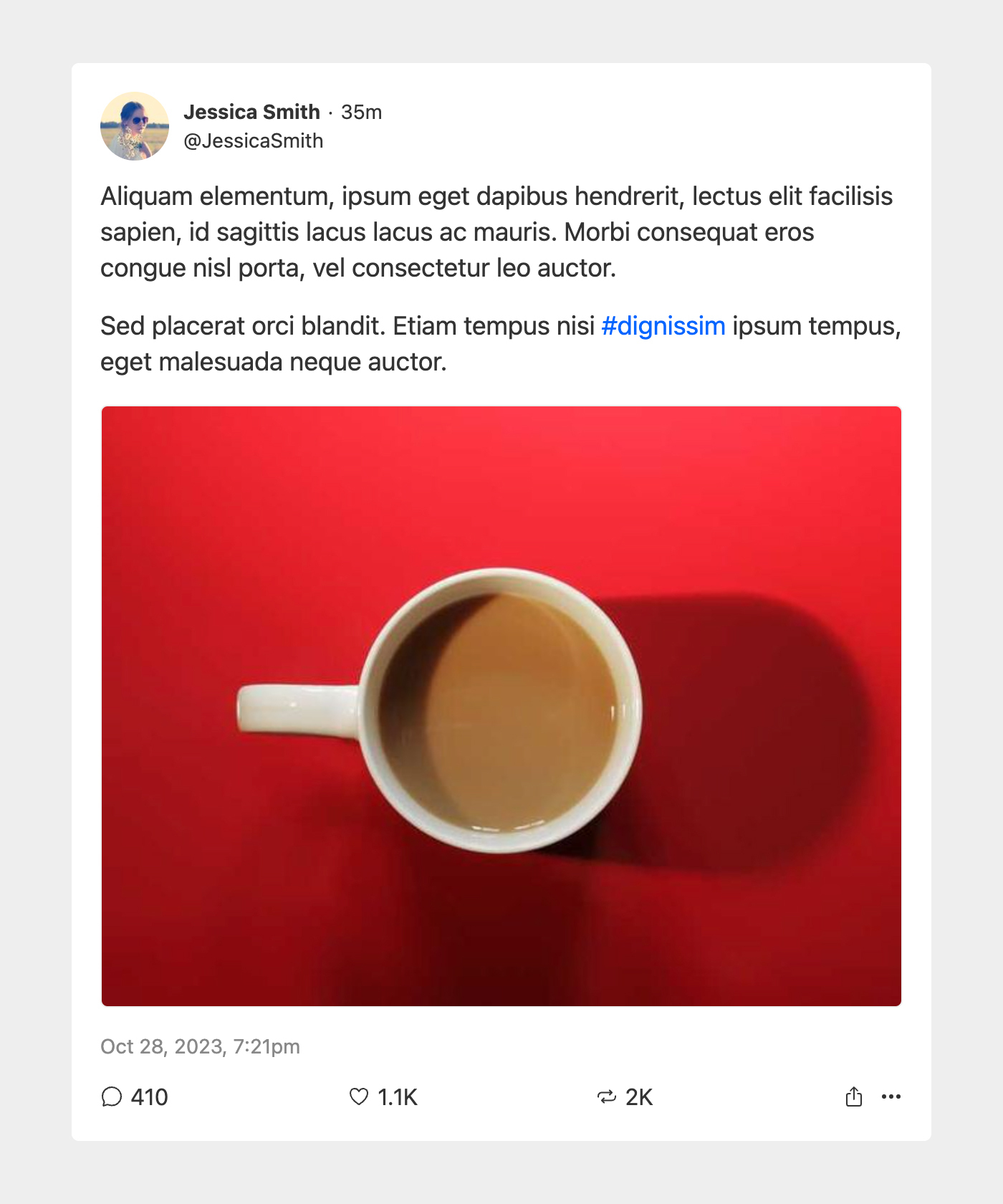
<article class="post h-entry">
	<header class="postHeader">
		<figure class="postAuthorAvatar">
			<a href="#">
				<img src="https://cdn.url/foo/bar/avatar.jpg" width="100" height="100" alt="Avatar for User Display Name" class="u-photo">
			</a>
		</figure>
		<div class="postMeta">
			<div class="postAuthor">
				<a href="#" class="p-author u-author">User Display Name</a>
			</div>
			<div class="postAuthorUsername">
				<a href="#">@username</a>
			</div>
			<div class="postPublished">
				<a href="#" class="u-url u-uid">
					<time datetime="2023-11-28T19:21:00-05:00" class="dt-published">35m</time>
				</a>
			</div>
		</div>
	</header>
	<div class="postContent e-content">
		<div class="postText">
			...Post text goes here...
		</div>
		<div class="postMedia">
			...Post media goes here...
		</div>
	</div>
	<footer class="postFooter">
		<div class="postDate">
			<a href="#" class="u-url u-uid">
				<time datetime="2023-11-28T19:21:00-05:00" class="dt-published">Nov 28, 2023, 7:21pm</time>
			</a>
		</div>
		<ul class="postActions" aria-label="Post actions">
			<li class="comments">
				<button class="postAction"></button>
			</li>
			<li class="likes">
				<button class="postAction"></button>
			</li>
			<li class="shares">
				<button class="postAction"></button>
			</li>
			<li class="share">
				<button class="postAction"></button>
			</li>
			<li class="misc">
				<button class="postAction"></button>
			</li>
		</ul>
	</footer>
</article>
Let’s break it down. First, I’m using <article> for the root element of the entire post, and as such, it has a post class. According to MDN Web Docs, the <article> element “represents a self-contained composition in a document, page, application, or site, which is intended to be independently distributable or reusable” — which sounds a lot like a social media post to me. The <article> is subsequently broken into three main sections or areas.
First is postHeader, which uses a <header> element since it’s, well, the post’s header. It contains information about the post’s author (e.g., their avatar and username) and a relative timestamp for when the post was published.
Second is postContent, which, as the name suggests, contains all of the post’s content, be it text, images, video, or embedded posts (i.e., reposts). It uses a generic <div> element. You may be thinking that I should’ve used the <main> element instead, but as MDN puts it, the <main> element “represents the dominant content of the <body> of a document,” which would probably never be the content of a single post. More likely, <main> would be a feed of posts, or perhaps an article on another site into which the post was embedded.
Finally, there’s postFooter, which uses a <footer> element since it’s, well, the post’s footer. It contains the full publication date as well as a list of available actions for the post (e.g., commenting, liking).
Some Additional Notes
In an earlier version of my post mockup, I wrapped the list of post actions in a <nav> element. Upon further reflection, though, I removed the <nav> element because the post actions aren’t really “navigation” items; they don’t necessarily take you somewhere else. Rather, they trigger functionality, such as firing off a request to the “like” API or toggling a “reposting” menu.
This is also why the actions use <button> rather than <a> elements or <div> elements with role="button" tacked on. Generally speaking, buttons trigger functionality, like submitting a form or launching a modal, while links take you somewhere else. (For more on this, I recommend Ashlee M Boyer’s exhaustive breakdown of when and how to use <button> and <a> elements.) Plus, using <button> elements confers some accessibility bonuses, including keyboard navigation and screenreader notifications.
All dates and timestamps are wrapped inside <time> elements with the datetime attribute specified. This ensures that the dates are machine-readable, which is useful for search engines. (CSS Tricks has a more detailed breakdown of the <time> element’s purpose and benefits.)
You’ll notice several odd-looking classes sprinkled throughout the HTML, including dt-published, e-content, h-entry, and u-photo. These are microformats that add structured data to the post, which makes it more consumable by other services (e.g., search engines) and brings it inline with IndieWeb and POSSE philosophies. (James Gallagher explains why microformats are good thing.) Microformats aren’t necessary, but given how siloed social media has become, I wanted my mockup to embrace as much openness and interoperability as possible from the get-go.
Blocks of code are all well and good, but here’s what the post looks like with placeholder content, CSS styling, and icons:
Simplify, Simplify, Simplify
Allow me to now state the obvious: the folks who work on Threads and Bluesky are really smart, and undoubtedly face some unique challenges while building and maintaining platforms that are used by millions of users every single day. (As of right now, Threads has an estimated 141 million users and Bluesky has 2.26 million users.) Nothing I’ve written here is intended to disparage their work. Also, my mockup lacks any of the interactivity that’s a given with such platforms, which necessarily adds a layer or two of complexity.
That said, I’m trying to push back against an ongoing trend in web development to over-complicate… well… everything. Obviously, web applications like social media platforms are, by their very nature, really complex. But the basic building blocks of web development are still what they are, which is easy to forget as new tools, frameworks, and build processes emerge and gain traction. Sometimes it’s just too easy to write a mess of HTML, CSS, and JS — or rather, have a build process generate it for you — when a handful of standard, semantically rich HTML will do just as well, if not better.
Threads and Bluesky’s convoluted code isn’t too surprising when you consider how so much of web development happens these days. But it doesn’t have to be that way. You don’t need a dozen nested layers of <div> elements, each with a glut of abstracted CSS classes, to display text and images — which is essentially what social media posts do. In addition, less code means there’s less to load in a browser (resulting in improved performance) and less to support (resulting in more efficient development and troubleshooting). And as an added bonus, using semantic HTML is an easy way to ensure accessibility.
While tools, frameworks, and build processes can certainly improve some aspects of web development, they present challenges of their own. Specifically, determining how to best rein in their excesses to allow room for simpler approaches and techniques that can work just as well — and with fewer nested <div> elements, to boot.