I’m Not Redesigning Opus, but When I Do…
Although it’s undergone some tweaks and adjustments, Opus’ design has remained basically unchanged since March 2022. Normally, I’d be seriously itching to completely redesign my site after three years, but I’ve been pretty satisfied with how Opus looks, feels, and performs, as well as the underlying code. (I’m particularly proud that the “cleft” effect in the header and footer was achieved entirely with CSS gradients.)
That said, I’ve been keenly aware of — and somewhat frustrated by — the design’s influence on how I write. To explain why, though, I need to start with a quick overview of modern blog design.
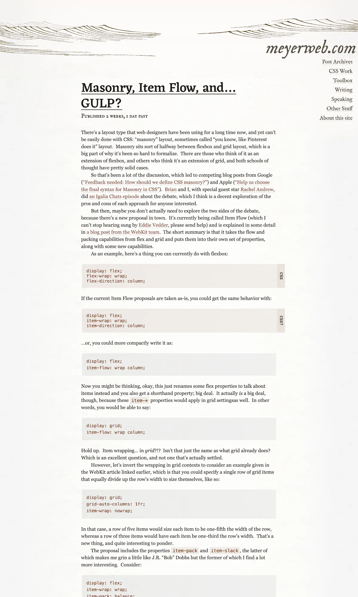
In a “traditional” blog layout — as seen on sites like Adactio, Simon Collison, and Eric Meyer — posts are typically displayed in their entirety, each with its own headline that, when clicked on, takes you to the post’s details page. (On some sites, only the first few paragraphs might be displayed, with a “Continue” or “Read more” link to the full post.)
One major upside to this “traditional” layout is that readers can simply scroll down the homepage to read all of the site’s latest content. (This is also often true for archive pages, like month and category.)
A major downside, however, is that all of those posts can easily blend together into a difficult-to-read wall of text, especially if the design doesn’t do a good job of separating or delineating individual posts. Also, depending on the number of posts and their length, as well as the amount of images and media they contain, “traditional” layout pages can take longer to load.
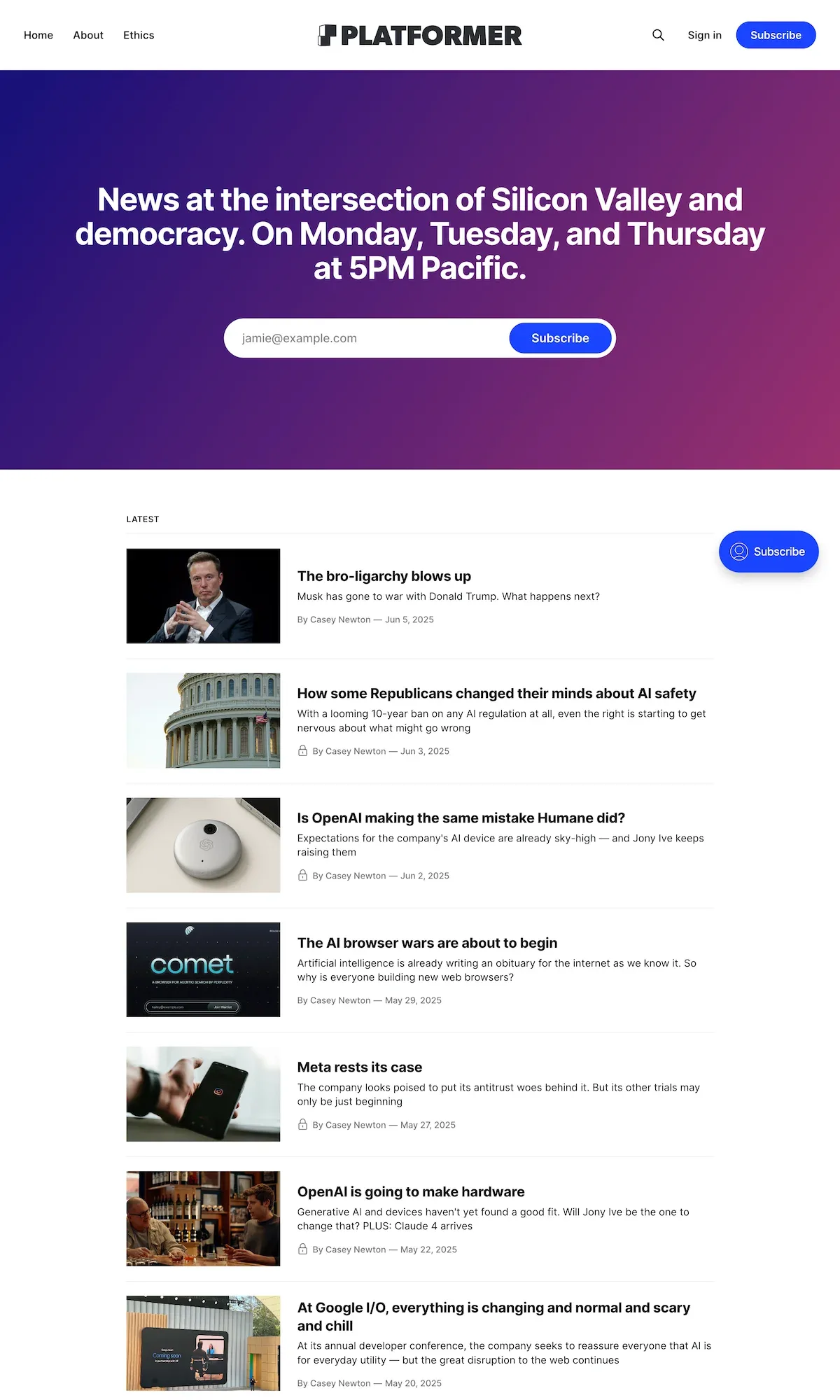
Compare that to Opus’ design, which uses what might be called a “magazine” or “newspaper” layout. Instead of seeing full-length posts, this layout presents a list of card-like post “snippets” that are typically some combination of thumbnail, headline, and excerpt. This type of layout is frequently used by Substack sites as well as sites like Christ and Pop Culture, Platformer, Politico, and Treble.
The “magazine” layout’s upside is that it presents content in more easily digestible chunks that take up less space and require less scrolling. It’s also easy to organize these post snippets, breaking them up into different sections based on topic or category. Think Christian does this on their homepage, with separate sections for music-related posts, movie-related posts, and so on. I even do it on Opus’ homepage, with a section at the top that displays the three most recent “featured” posts.
The “magazine” layout’s downside is that there’s less content immediately available to the reader, i.e., they can’t see and read all of the site’s latest content simply by scrolling down the page. Instead, they must click into each individual post to read them, which can get tedious depending on how many posts there are, and how many they want to read.
I’ve used both types of layouts on Opus over the years before settling on the “magazine” layout because I felt like it would encourage me to write longer, more thoughtful and intentional posts as opposed to just posting whatever came to mind. If I wanted to post something short and off-the-cuff, then that’s what social media’s for.
I still stand by the opinion — for the most part. What I didn’t take into account, though, was that (A) I would eventually want to become less dependent on social media for my online platform, and (B) occasionally, I do want to post something off-the-cuff, like linking to an interesting article or video with only minimal commentary.
Of course, there’s nothing technical that prevents me from posting short, off-the-cuff “status” updates; Opus’ CMS can support that format with no difficulty at all. It’s primarily a design-related issue. Given their more ephemeral nature, “status” updates really fit best within a scrollable newsfeed context, and not in a “magazine” layout where you must click on a headline to see each and every post, even posts that might just be a sentence or two.
Some sites, like Daring Fireball, Manton Reece, and Jason Kottke, mix longform full-length posts with shorter snippets, blurbs, and updates. (I especially like how Kottke displays previews of the links he shares, similar to what you see on Bluesky and Facebook.) Although I prefer the “magazine” layout overall, with its easier-to-digest presentation and the way it encourages (for me, anyway) more intentional writing, I do think those aforementioned sites enjoy fewer limitations on the types and formats of posts they publish. Ultimately, I want that sort of flexibility for my writing here on Opus.
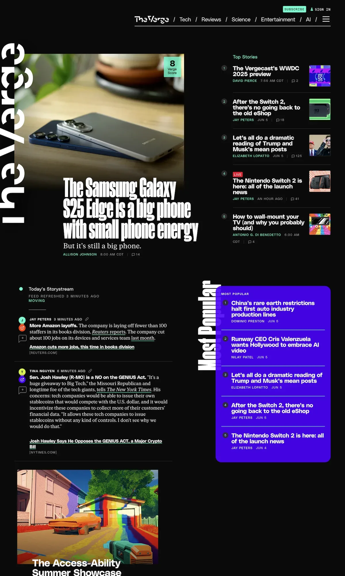
I think The Verge’s homepage is a good example of the sort of layout I might be aiming for. Granted, they publish a lot more content than I do, and they also have ads and sponsored content. As a result, their homepage can get cluttered and overwhelming. Still, it’s an interesting blend of “magazine” layout and social media feed, and it’s along the lines of what I’ve been considering for the next iteration of Opus — whenever that takes place.
There are other, more important things that need to happen before I commit to a wholesale redesign, namely upgrading to Craft v5 (which will also require migrating to a new hosting environment). Even so, design-related issues like this are always rattling around inside my head, which is all part of the blessing/curse of running your own website.