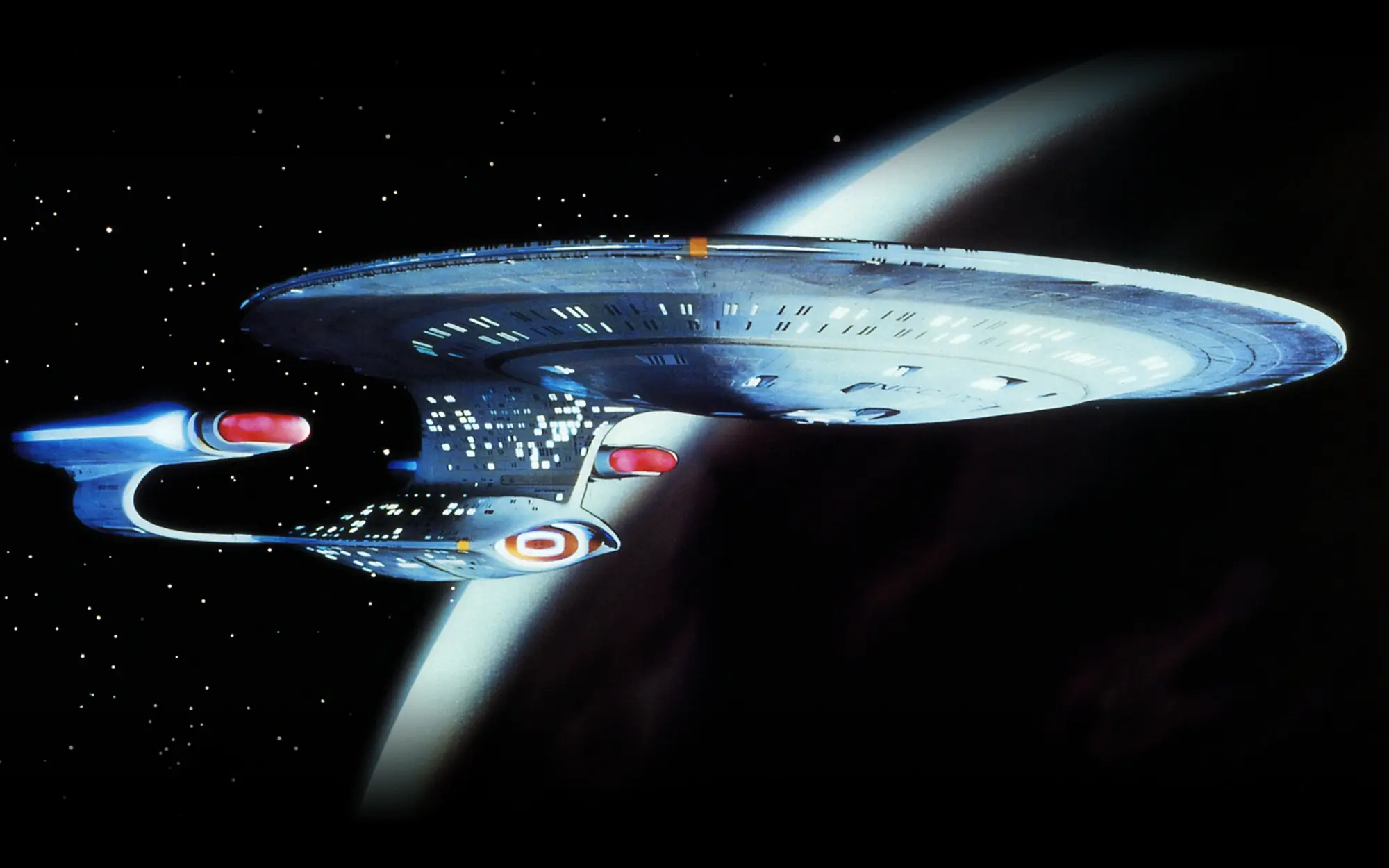
When Gene Roddenberry and his team set out to revive Star Trek two decades after the original series’ run, arguably one of their biggest challenges concerned their biggest star: the U.S.S. Enterprise herself. The Next Generation was set almost a century after the original Star Trek series, so how would Roddenberry et al. create an even more advanced version of the iconic starship that had traveled to the furthest reaches of the galaxy and beyond? And just as importantly, how might this new Enterprise reflect real-world technological developments, particularly in the area of computers?
The answer to those questions was the U.S.S. Enterprise-D, and suffice to say, the efforts of Roddenberry and his team of artists and designers, which included Andrew Probert, Rick Sternbach, and Michael Okuda, were a complete success. To this day, the Enterprise-D remains one of the most beautiful and striking spaceships in all of sci-fi, as well as Starfleet’s crown jewel. Yes, even more so than the original Enterprise crewed by Kirk, Spock, and the rest of the TOS crew.
That will no doubt be blasphemous for many Star Trek fans. So just to be clear, the original Enterprise form factor will forever remain iconic, both its first incarnation by Matt Jefferies as well as the Enterprise-A revealed at the end of Star Trek IV. But when I look at the Enterprise-D, there’s an undeniable sense of purpose and intentionality that gives it more than just verisimilitude; it looks and feels exactly like what a futuristic version of the already futuristic Enterprise should look and feel like.
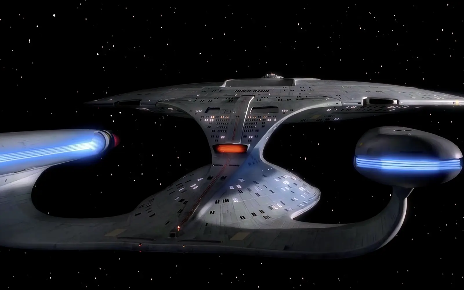
The sleek, graceful lines communicate advanced engineering and material capabilities, as you’d expect in the late 24th century. The forward-leaning pylons, which are connected to the back of the warp nacelles, suggest speed, as if the ship is forever yearning to jump to warp. The many curves — the shape of the nacelles, the “hood” that connects the saucer and engineering sections, the saucer section itself — possess an organic-ness that feels perfect for a ship that is more than just utilitarian or military. For a ship that doesn’t just carry a crew, but is home to families and communities.
Put simply, the Enterprise-D remains faithful to that classic form factor while updating and evolving it in very distinct ways that make sense for the setting and communicate the ship’s 24th-century capabilities.
That extends the ship’s interior, as well. Which, yes, is pretty beige. (Not even the 24th century could escape the ’90s, it seems.) But there’s something purposeful about that, an acknowledgement that the Enterprise’s many crew members and passengers might need something a bit more calming and comfortable while out on deep space missions.
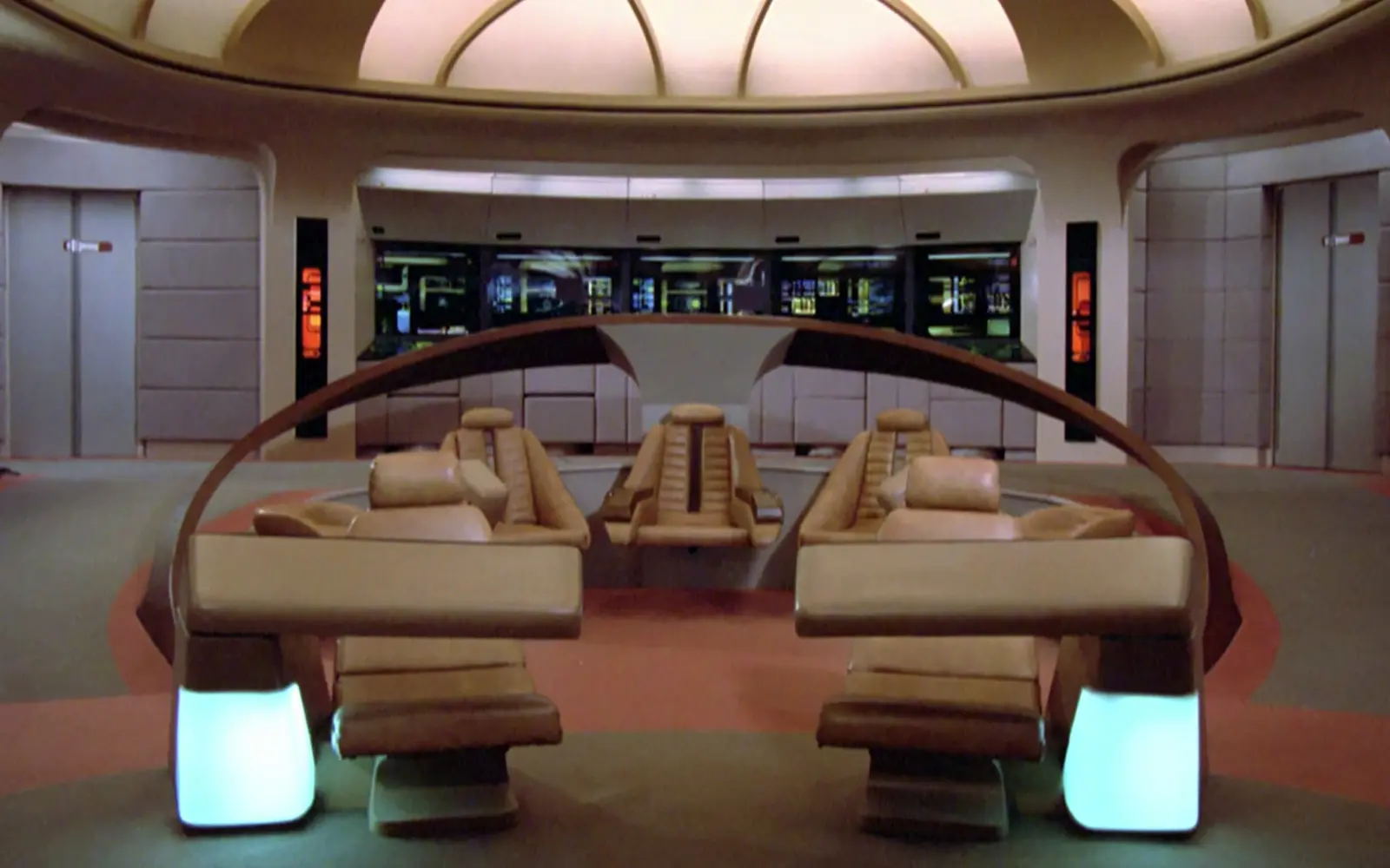
Funnily enough, Jefferies was less than pleased with this aspect of the Enterprise-D, complaining that Roddenberry “had taken the bridge of my ship and turned it into the lobby of the Hilton” — no doubt referring to the open space, plush seating, and Worf’s tactical control station. Granted, that last feature does look a little like something out of a hotel lobby thanks to its expensive-looking wooden façade, but that also injects some warmth into the bridge. Meanwhile, the graceful wings curving around the command chairs communicate a sense of defense and protection as befitting a stalwart Klingon security chief.
But even if the beige decor might look a little dated, one aspect of the Enterprise’s interior that still feels futuristic is its computer interfaces. These days, touch screens are all over the place, from our phones to our cars and refrigerators. But when The Next Generation premiered in 1987, the touchscreens that the Enterprise crew used to navigate the ship, conduct experiments, communicate, and fire weapons didn’t just seem cutting edge; they seemed like the very ideal of how you’d use an advanced computer system.
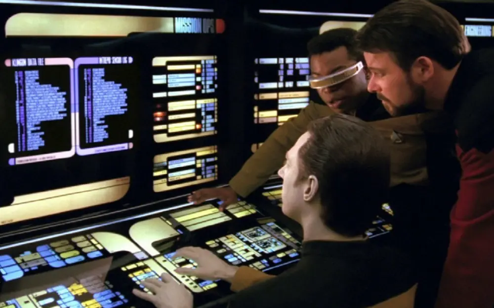
Much of that’s due to Michael Okuda, who designed the graphical interfaces for the Enterprise’s LCARS operating system. One of the key principles of these interfaces, often called “Okudagrams” in honor of their creator, was that they were adaptable to each user’s needs. As noted in the Star Trek: The Next Generation Technical Manual (yes, I still have my copy that I got back in high school), some of this was intended to communicate advanced computing functionality, while some of it helped with the realities of TV production:
We incorporated the concept of software-definable, task-specific panel layout into our controls because Mike thought it a logical way of simplifying designs that would otherwise have been nightmarishly complex. The basic idea is that the panels automatically reconfigure themselves to suit the specific task at hand. A side benefit we discovered is this gave our actors much more freedom in hitting controls to accomplish various tasks. (Even though our cast tries to get things right, there are numerous occasions when a particular shot will require an actor to hit a button on a specific area of a panel, which may not reflect our original design for that panel.) Variable-layout control panels mean that the button that fires phasers this week is not necessarily the same button that fires them next week.
Thanks to Okuda’s detailed designs, the Enterprise-D’s computer UI still feels futuristic even now, when touchscreens and adaptable interfaces are quite commonplace. More importantly, it’s a tangible UI that feels useful and usable, like something that might actually be practicable even in the 24th century. Contrast that with the holographic interfaces featured in newer Trek series like Picard, which basically consist of people gesturing wildly in the air while bright lights dance around in front of them. Once you get past their “gee whiz” factor, such gestural interfaces quickly reveal themselves to be silly, impractical, and decidedly un-Star Trek. (To my mind, one of the few series to feature gestural interfaces that make sense is The Expanse.)
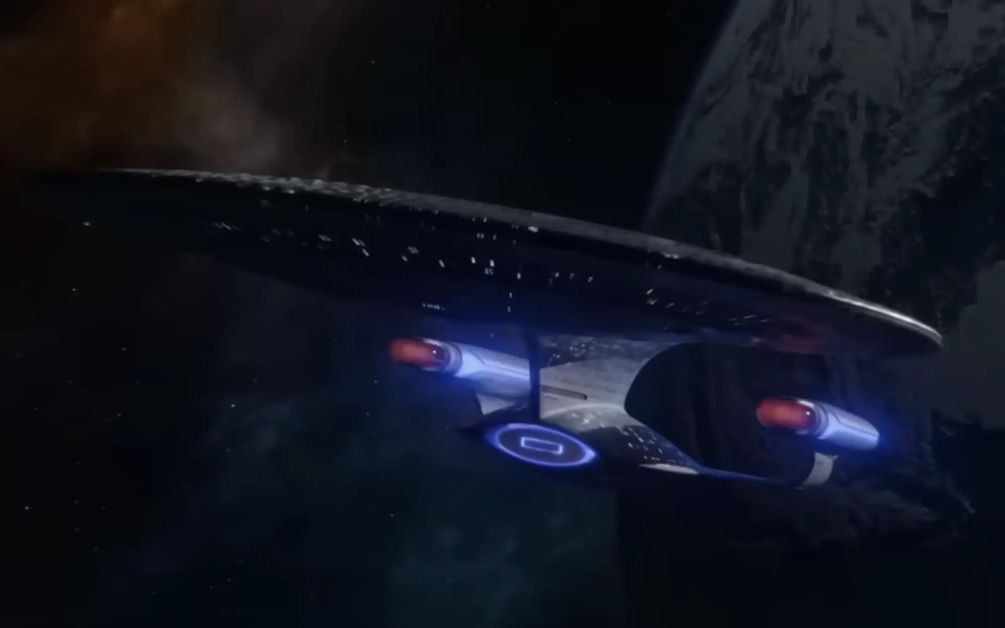
The Enterprise-D is beautiful, both inside and out. Unfortunately, it just wasn’t meant to last. After its destruction at the end of 1994’s Star Trek Generations, Picard and his crew were given the Enterprise-E, which still looked pretty cool while reverting back to some aspects of the original Enterprise design (e.g., the warp nacelles and their back-swept pylons). The Enterprise-D made a triumphant, albeit brief, return in Star Trek: Picard’s third and final season, only to return to the Starfleet Museum and make way for the Enterprise-G. Whereas the Enterprise-D wasn’t afraid to wholly evolve the ship’s form factor, the Enterprise-G’s design sticks far more closely to the original with a few updates sprinkled here and there, resulting in an awkward and ungainly mashup of old and new.
Of course, Star Trek doesn’t just take place in the 25th century now. Thanks to Discovery and Starfleet Academy, the franchise also now exists in the 32nd century. Which raises the question of whether or not the Enterprise is still traveling the galaxy, and if so, what it looks like.
There’s been some conjecture that Starfleet Academy’s second and final season represents a perfect opportunity to reveal an even more futuristic incarnation of Starfleet’s most well-known starship. If and when that happens, one thing’s for certain: The Enterprise-D set such a high bar, and was so successful at updating and refreshing one of sci-fi’s most beloved spaceships, that whoever is tasked with conceiving and designing the next Enterprise will certainly have their work cut out for them.